
Contextual study point 1 : Louise Bourgeois (1911-2010)
I find Louise Bourgeois’ work to be very frank, with subject matter that I can absolutely relate to. Themes of loss, nurture, fear, betrayal and self criticism are explored in her work as tangible confessionals using a range of media. This contextual study into her insomniac drawings from 1994-5 and collaboration with Tracey Emin ‘Do not Abandon Me’ (2013) has sparked many parallels for me both emotionally and in terms of themes for my own work.
Tracey Emin commented that “everything she [Bourgeois] did was about balance” ( Tracey Emin on Louise Bourgeois: Women Without Secrets – Secret Knowledge 1/2 and 2/2, 2013), citing her drawings as gentle, psychological and reflective. Emin speaks of being in awe of Bourgeois’ credentials as an artist and her surrealist contemporaries, but also of the fragility of her drawing. I notice the vibrant bloodlike texture of the ink and watercolour used by Bourgeois – vulnerable but also strong; balanced with the pencil drawing additions by Emin, empowered by Borgeois. Symbiotic media, providing the balance that Emin noted.
In reference to Bourgeois’ insomniac drawings (Louise Bourgeois, I Give Everything Away at The Fruitmarket Gallery): Francis Morris, guest curator and friend of Bourgeois describes the pieces as confrontational : revealing a vulnerability. She comments that these 220 pieces were not done to be seen. That these were like going into her mind – a relevant response’ I feel : the fluidity of the media, image and this sense of interacting with Bourgeois’ thought processes. It does not feel voyeuristic, more so therapeutic and honest. Both Morris and Emin describe the work of Bourgeois as youthful and at the forefront of contemporary art
Having had a challenging childhood and the recent discovery of the identity of my birth father, my work takes a contemplatory path, with questions of identity and the desire for balance and resolution being common threads.
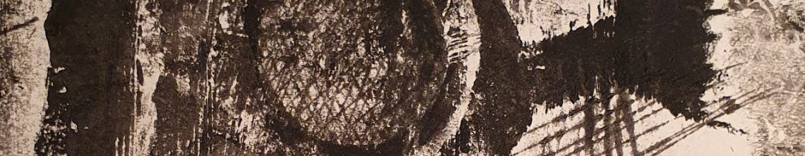
10am is When You Come to Me (2006)

This artwork is combination of 20 pieces (each: 380 × 910 mm) that depict the hands of Bourgeois and her assistant Jerry Gorovoy. The title relates to the time that he would start their collaborative working day. The images are etchings with watercolour, pencil and gouache paper, most with musical staves drawn in pencil. These images demonstrate Bourgeois’ view that if needed, Gorovoy would pull her out of a well (Morris 2007, p.150.)
The use of red denotes, life, love and the devotion of their relationship. Again the use of watercolour replicating the vibrancy and fluidity of blood. Hands feature in many works by Bourgeois, often as a symbol of dependence. The hands sometimes touch, often look like they are slipping away- reaching, seeking connection.
The work features splatters from the making. The Museum of Modern Art (MoMA) website states “The compositions were created from tracings of the artist’s and the assistant’s hands and arms, which Bourgeois arranged for each composition. Prior to the etched compositions, Bourgeois created a series of 7 drawings, also titled “10 AM Is When You Come to Me”. (Deborah Wye, Chief Curator Emerita, Department of Prints and Illustrated Books, MoMA 2014)
References
I Give Everything Away (2013) [user-generated content online] Creat. Senga, N. 4 November 2013 at: https://www.youtube.com/watch?v=eiOHA0INiqA (Accessed on 15 February 2020)
Madden, A. (2014) Louise Bourgeois: 10 am is When You Come to Me at: https://www.tate.org.uk/art/artworks/bourgeois-10-am-is-when-you-come-to-me-al00345 (Accessed on 15 February 2020)
Tracey Emin on Louise Bourgeois: Women Without Secrets – Secret Knowledge 1/2 (2013) [user-generated content online] Creat. Art Documentaries 28 November 2013 at: https://www.youtube.com/watch?v=TiGjzV7Nk48 (Accessed on 15 February 2020)
Tracey Emin on Louise Bourgeois: Women Without Secrets – Secret Knowledge 2/2 (2013) [user-generated content online] Creat. Art Documentaries 28 November 2013 at: https://www.youtube.com/watch?v=Vbhxr6ud8b4 (Accessed on 15 February 2020)
Deborah Wye, Chief Curator Emerita, Department of Prints and Illustrated Books (2014) : 10 AM Is When You Come to Me at : https://www.moma.org/s/lb/collection_lb/objbypib/objbypib_pib-12-13_sov_page-31_image-1.html (Accessed on 15th February 2020)
Exercise 1.1 : Experimenting with immediacy and fluid line
Method :
- Take 20 or more sheets of paper
- Draw with fluid media. Identify a dry media ‘counterpoint’
- Draw at a time which is suited to reflective mental space
- Draw on the paper in rapid succession
- Revisit drawings. Reflect. Respond with counterpoint dry media
Action :
My initial fluid media drawings using Ultramarine tube watercolour on 20 x A4 paper are a commentary on a day spent in Hastings with my daughter, chronologically mapping our day at the aquarium, the shipwreck museum and the Hastings Contemporary gallery. The drawings were made following a night awake with a hacking cough.


Reflections :
It took me many days to commit to the 20 pieces of blank paper. It worked for me that after many days of illness the one subject in my mind was the day that we had managed to have out of the house together.
When I draw,I have a tendency to overwork and use bold lines and shadow. I found drawing with the fluid media very freeing and enabled me t be produce more gestural drawing (which is something I am hoping to develop), Some of the drawings relate to movement whereas others, including those where I recorded comments from the events and observations of the day, were more representational. As I drew I felt there was a natural journey between images and although I am happy with some of the drawings as outcomes in themselves,I think the drawings as part of a narrative work well. I tend not to draw from memory and this was a really good exercise for me as I was not limited by over thinking how I would draw the people for example. The pace of the fluid line quickened as I worked and my movements became more instinctive. There was some pooling of the paint and that has resulted in some pleasing tonal variation.
Counterpoint response :
My dry counterpoint is a yellow soft pastel.


Reflections :
In using my counterpoint medium, I feel that there s an added depth to some of the drawings and highlight to others. I added some words as I reflected on the juxtaposition of the encased fish (set me free) and the flying figures (freedom) drawn in response to Quentin Blake’s ‘Airbourne’ watercolours. My reflection on the vibrancy and essence of life and the movements observed guided many of my additions with the soft pastel. My additions with the pastel were intuitive. Additionally I continued to refer to the 20 drawings as one complete piece of work and sought to link these coherently. I particularly like the contrast of the tonal blue with the sharpness of the yellow. I chose these colours for their nautical characteristics feeling that they are appropriate to the subject and theme of my drawings, a day by the sea.
Contextual Study Point 2 : Geraldine Swayne (1965 -)
Geraldine Swayne is a contemporary artist and musician (a member of the band Faust) who paints people in a range of contexts at varying scales. On her website in the folders of early Paintings 2006-07, 2008-09, 2009-10, 2010-12 [note :the folder Paintings 1 no longer exists on the site] there are many pieces that fuzz the distinction between drawing and painting.
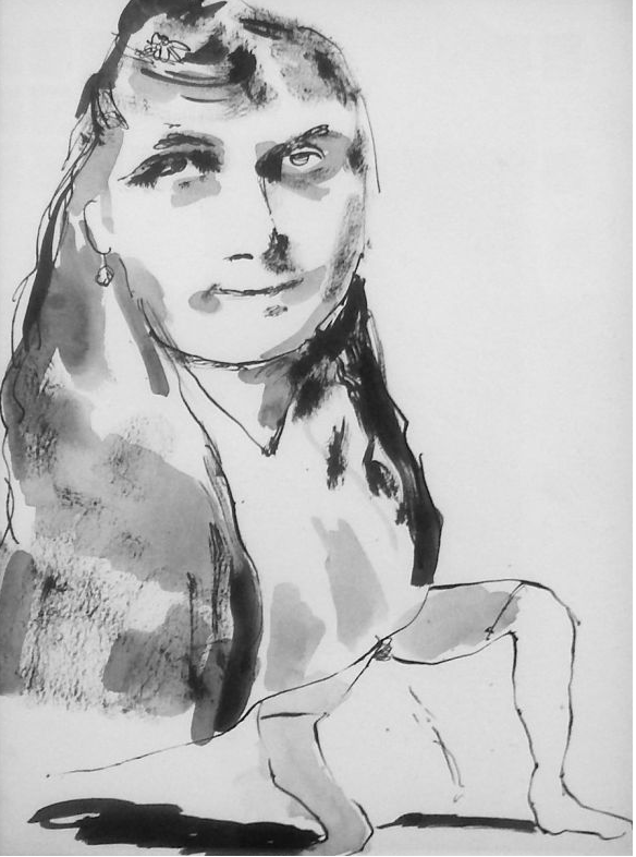
Fig 1 .Geraldine Swayne 2011 – ink on paper A4
It is possible that this piece is a drawing in its own right. The image appears to be of a well dressed woman urinating. Much of Swayne’s subject matter is very honest and not afraid to bring attention to the uncomfortable. There is humour in her work too ; see Karl Marx as a Puppy (2020). When looking at her body of work, I get the impression that drawing with fluid media is just one of her ways of presenting her ideas. as an outcome in itself.
By exploring the images on her website though there is evidence repeated or linked images. In the two pieces below, the pose and styling of the swimmers are noticeably similar. I think though that the watercolour is a strong image in it’s own right.
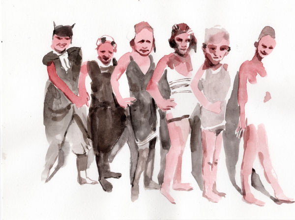
Fig 2. Geraldine Swayne. Watercolour on paper. A2. 2012 (Private Collection)
Fig 3 Geraldine Swayne (Private Collection)
She says of her work :
“My work has a very strong narrative feeling to it although it’s quite non-specific. The paintings look like heightened moments from films where you don’t know what’s going on but there’s a powerful emotion present. It’s not that someone’s sad or happy or crying, it’s like a moment of transformation or of something being revealed to them, there’s a funny atmosphere. There’s also an emotional narrative that people project on the work. When they see my pictures they often respond powerfully, some people have cried or said it’s like a dream or nightmare they can’t shake off.” (Wall Street International. 2015)
Her beautifully painted explicitly pornographic enamel miniatures are where I find this is most evident. Although portraiture, there is much movement in her work and I think her use of fluid media supports, enhances and reflects this.
Her work has been described as ‘a subtle brevity of form and lightness of touch to Swayne’s style which aligns her with artists such as Edgar Degas, and more recently Chantal Joffe, Ron Kitaj, and Marlene Dumas.’ (Mutual Art 2017)
I think whether working in ink, oil, acrylic, enamel or any other medium; Swayne’s work thrives on that ability to define as well as portray a blurred fluid form. Some work such as Silver Swans Ballet Corps (2018) look almost photographic.
In Wire Magazine (March 2017), Swayne describes this element to her work : “Silver-ing is also the name of a difficult and arcane form of mirror-making, which is very close to photography, nearly trapping phantom reflections onto a surface, which is an idea I love. It’s also silvering, as is silvering hair! It was funny how ephemeral themes in my work got described by the material so well.”
Illustrations
Fig 1. Swayne, G. (2011) ink on paper – A4 (private collection)at : https://www.geraldineswayne.org/photo_10047587.html (accessed 22/02/20)
Fig 2. Swayne, G. (2012)watercolour on paper – A2 (private collection) at : https://www.geraldineswayne.org/photo_10045928.html (accessed 22/02/20)
Fig 3. Swayn, G (private collection)at : https://www.geraldineswayne.org/photo_10013328.html (accessed 22/02/20)
References
Geraldine Swayne : Silvering. The Fine Art Society London, UK. MARCH 28, 2017-APRIL 19, 2017 at https://www.mutualart.com/Exhibition/Geraldine-Swayne–Silvering/E6C99FED07E43DEE (accessed 23/02/20)
Gallery : a selection from Faust member Geraldine Swayne’s retrospective at https://www.thewire.co.uk/galleries/gallery-a-selection-from-the-faust-member-geraldine-swayne-s-retrospective (accessed 23/02/20)
Geraldine Swayne. What Do You Want…? 27 Feb — 21 Mar 2015 at the Lawrence Alkin Gallery in London, United Kingdom. 24 FEBRUARY 2015 at https://wsimag.com/art/13513-geraldine-swayne-what-do-you-want-dot-dot-dot (accessed 23/02/20)
Exercise 1.2 Using Fluid Media to add tone
Prior to working on the exercise, I experimented in my sketchbook:


For this exercise I chose to draw one of my black DM boots with an anglepoise lamp as a lightsource to add tonal contrast. I used diluted Frisk drawing ink as my fluid media and willow charcoal as the dry counterpoint. I chose to draw on brown parcel paper which I cut to 30cm x 30cm. I like to use this paper as it has a coarse and slightly pourous texture on one side and a slightly waxed surface on the other, that impacts interestingly when using fluid media.


As I drew the tonal areas with the ink I noticed that I was very aware of negative space and used this to shape the tonal shapes. When I drew with the charcoal details and definition, I found the tonal shapes very useful in guiding me drawing and maintaining the form of the boot.

I am very pleased with this drawing and I like the contrast of the ink and the charcoal.
For the comparative drawing I used charcoal, again drawing on the brown paper. This time it took me three attempts to gain a shape to the boot that I was happy with. A benefit of using this paper with charcoal is that I was able to wipe away the initial images that I was unhappy with and start again without any unnecessary waste.

Reflection
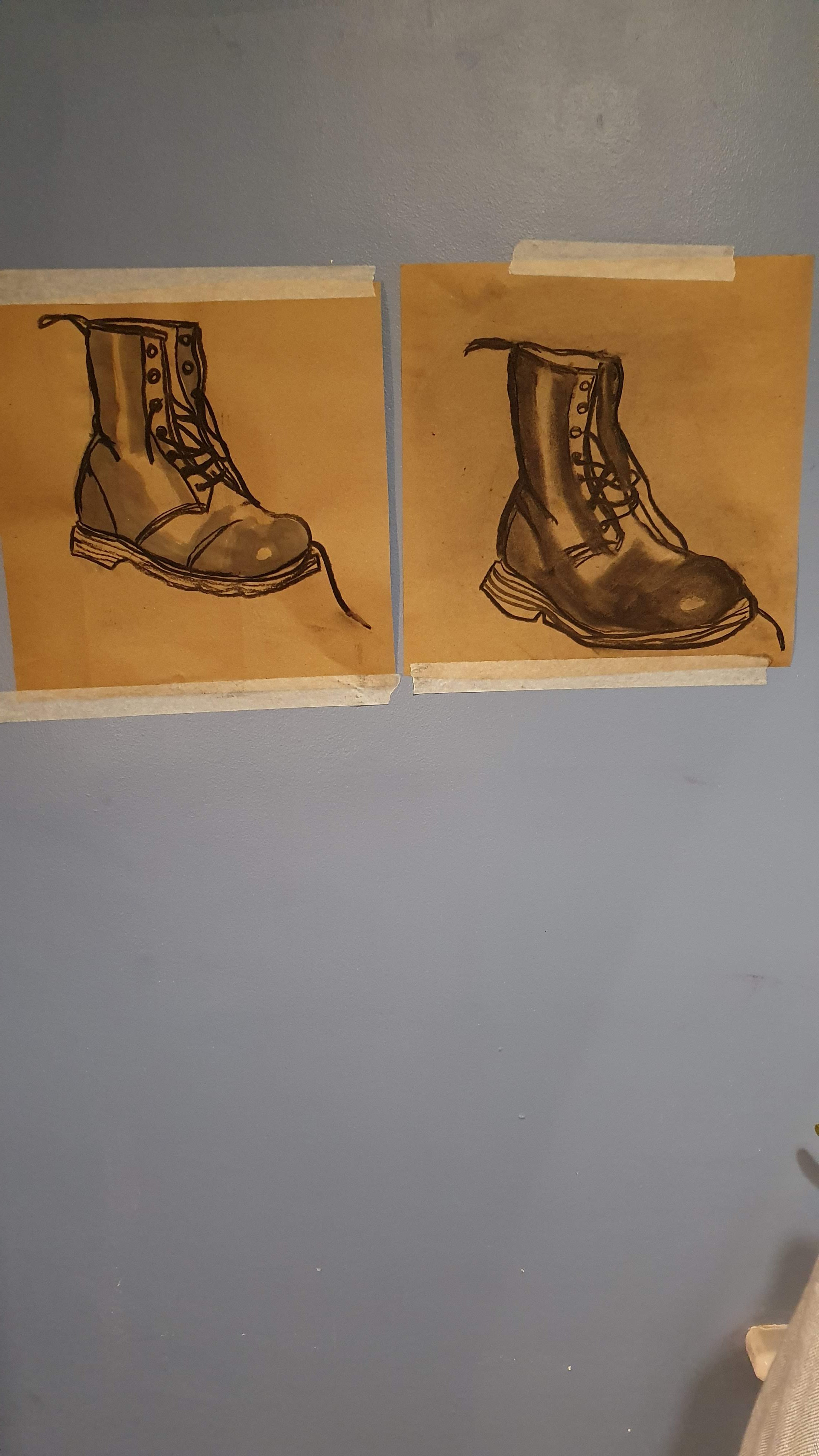
When comparing these two outcomes I prefer the first with the fluid media tone. It was more enjoyable to work on, as the tonal areas that I had observed so closely guided my drawing of the whole boot. I feel that the fluid media adds to the credibility of the boot as a 3d object. I enjoyed how quick and accurate the charcoal definition felt and I benefited from the tonal shapes when drawing the detail as they provided a pre-existing shape.
While the two drawings are very similar, I feel that the first drawing is truer to the boot that I was observing; in the second drawing the leg is a little too long and the width of the boot is larger also. A key observation here though is that the blocking of the tonal areas for the first drawing was helpful for my drawing of both images, ie as if creating a tonal muscle memory. I very much enjoyed this exercise and found it inspirational for future work.
Contextual study point 3 : Franz Kline (1910 -62)
Kline was an American Abstract Expressionist ,who had previously been an artist who was prolific in traditional landscapes and interiors, winning a host of awards for his work by the early 1940s.
By the late 1940s he had become inspired by his associate Willem de Kooning to experiment with abstractism, monochrome and scale. It was at this stage that he moved from drawing furniture in a phone book to producing the large scale black on white paintings (using household paint) that are so synonymous with his name.

Meryon 1960–1
© ARS, NY and DACS, London 2020
“Kline employed intense tonal contrasts, often working at night under strong light. His use of housepainters’ brushes produced tiny splatters and inflections on the canvas that enhanced the explosive quality of his black lines.” (Guggenheim)
By shifting the scale of his drawing through the use of a projector, he not only changed the quality of the lines, he also changed his interaction with his materials, working with large powerfully gestural movements reflected in the strength of his images.
I find the dynamism of his work very impactful. The notion of taking a small drawing and expanding its scale and power has triggered me to look at line and structure and reflect on the possibilities of re-imagining my observations.
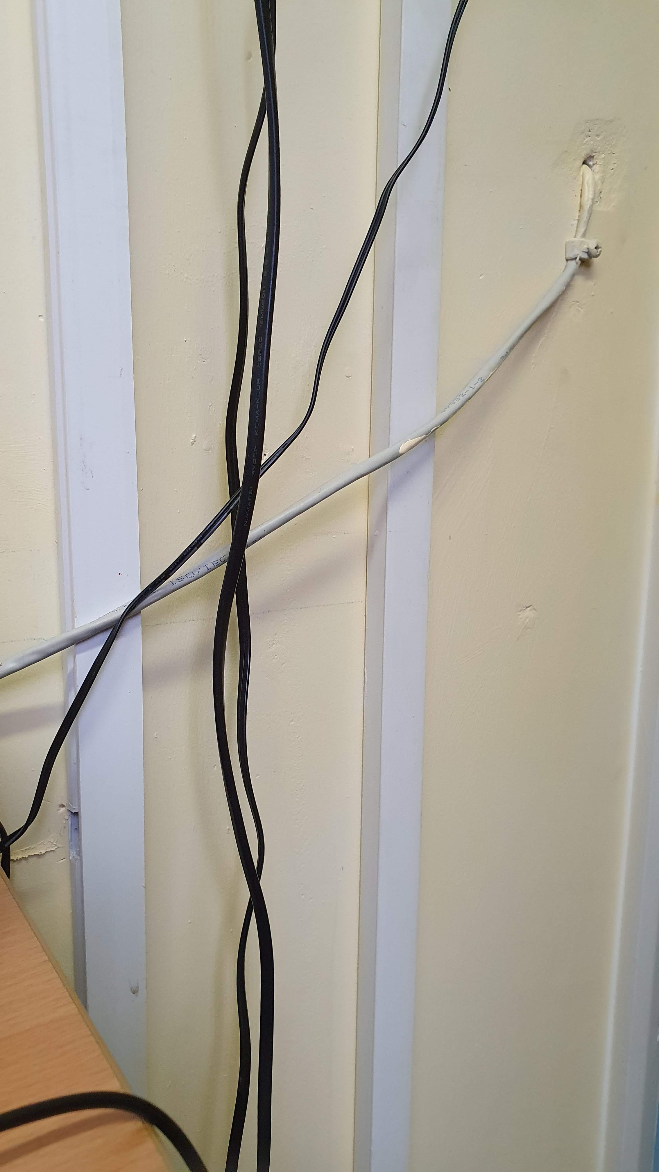 wires in my office
  sketchbook drawing(A5)
Illustration
Kline, Franz. Meryon (1960-61) https://www.tate.org.uk/art/artworks/kline-meryon-t00926
References
AB EX NY : The Painting Techniques of Franz Kline (Museum of Modern Art) [user-generated content online] 24th October 2010 at :https://www.youtube.com/watch?v=xyTxrbsfLpg (accessed 02/03/2020)
Franz Kline in Action(Christies) [user generated content online] 28th October 2014 at https://www.youtube.com/watch?v=R4FofJ0FiEs (accessed 03/03/2020)
Collection online : Franz Kline at https://www.guggenheim.org/artwork/artist/franz-kline(accessed 04/03/2020)
Franz Kline (1910 – 1962) at https://www.tate.org.uk/art/artists/franz-kline-1419 (accessed 04/03/2020)
Franz Kline at https://gagosian.com/artists/franz-kline/ (accessed 04/03/2020)
Exercise 1.3 Experimenting with dynamic gesture – 1
Seeking out subject matter with strong directional lines :
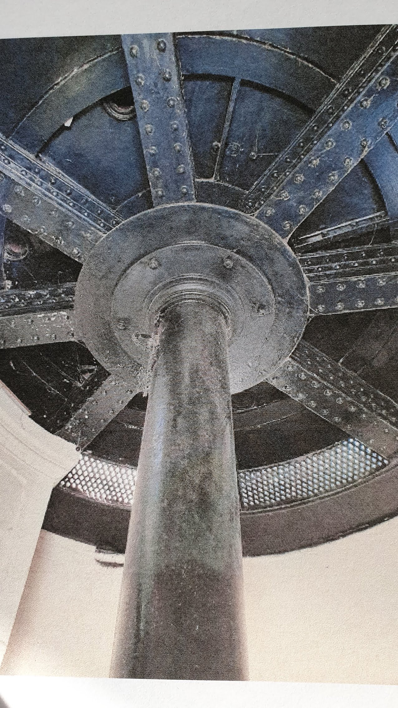
I live by the sea and close to an industrial port and am drawn to Victorian engineering which lends itself to having many collated structural images to choose from in this instance.
Charcoal sketchbook studies (A3) :
For this exercise I have chosen the iron interior mechanism of the old lighthouse at Dungeness. Having straight and curved lines I felt that it would provide greater challenge, as would the subtle tonal variation.


I think I prefer this first drawing prior to adding a grey tone. The contrasting naive second stage is much more appealing my opinion, though the wonky curve would need attention if my exercise piece takes this as its inspiration.
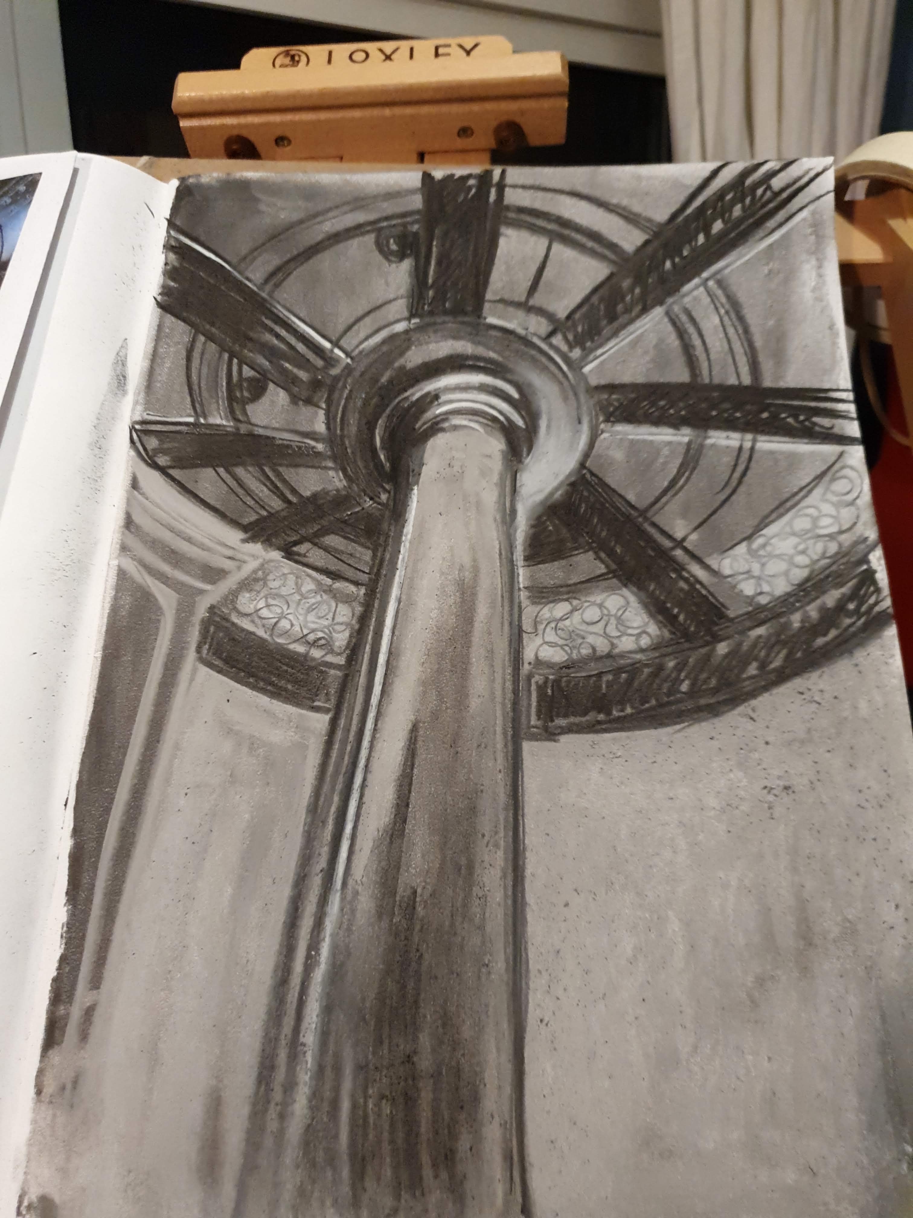
This drawing started as a subtractive drawing. I am pleased with the sense of perspective.

This drawing started as an arms length continuous line drawing. I certainly had less control when drawing this but I enjoy the sense of movement here. The use of blue really appeals to me here and I will consider using this in my paint drawing.
Finally I cut a view finder to focus my attention to different aspects of the orginal photograph.


By looking closely at the mechanism, the positions of, and connections between, the parts of the mechanism, I have developed an effective sense of the negative space, tonal values and the way that the parts fit and move together.
Fluid media piece on cardboard (42cm x 90 cm) :
I decided to work on a larger scale, than I usually opt for, for this piece. I wanted to investigate whether scale would impact on the dynamism of my movements and the image while working,
I prepared the cardboard with white gesso and opted for white and black acrylic paint and I added some blue acrylic also. I used 2″ household painting brushes, my fingers and scraps of stiff cardboard to drag and cut into the paint and wooden toothpicks to mark make into the paint.
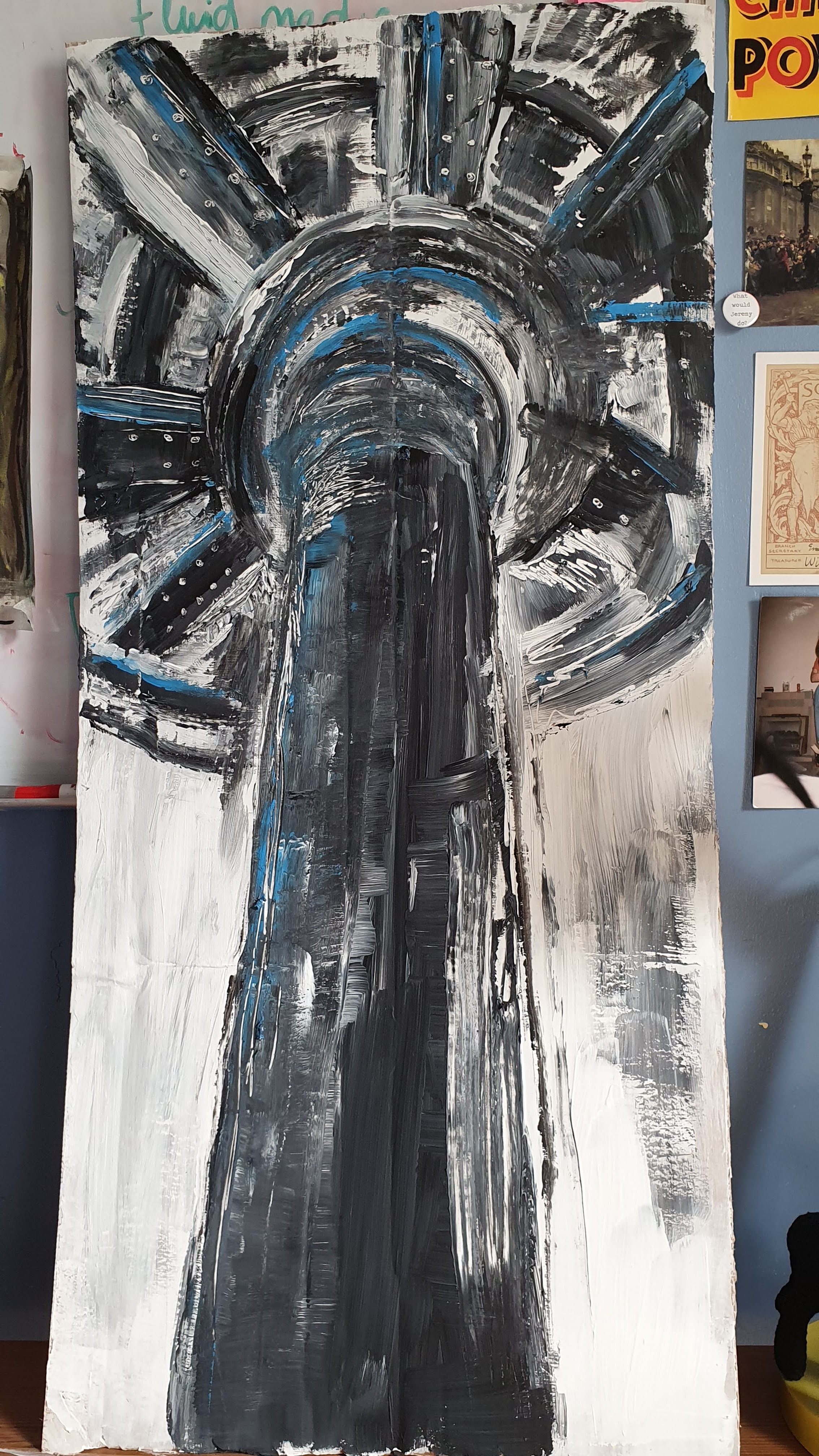
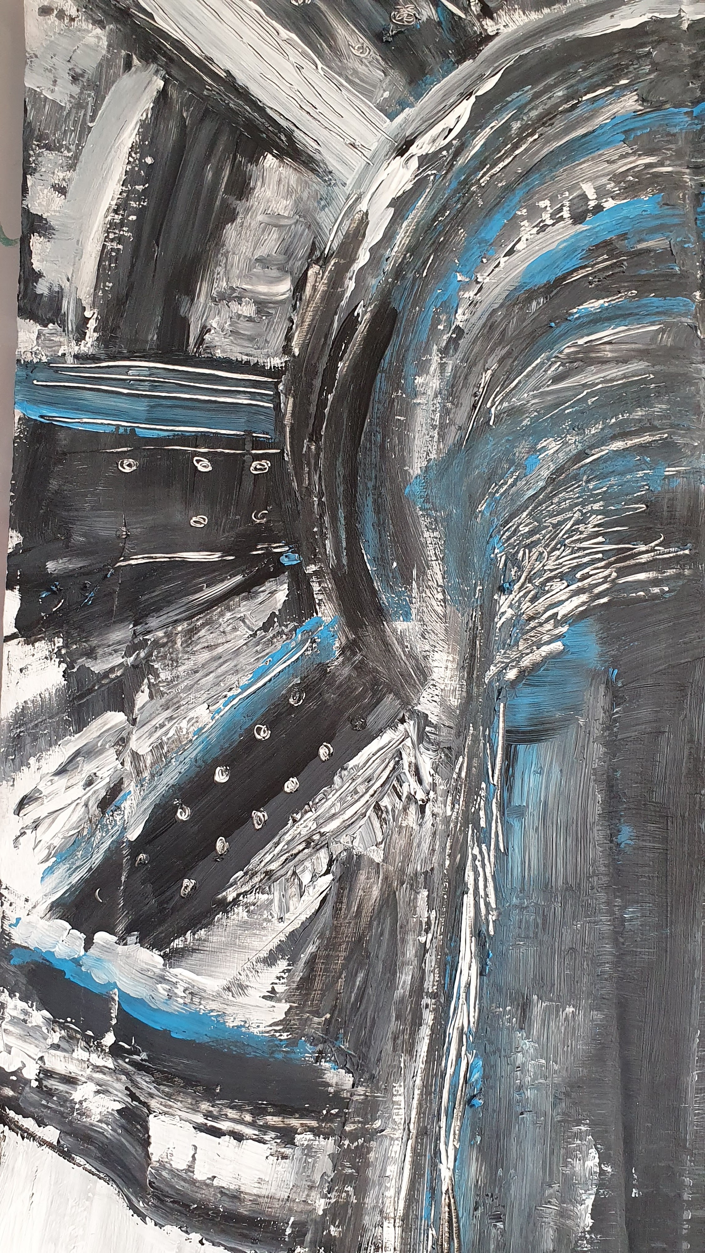
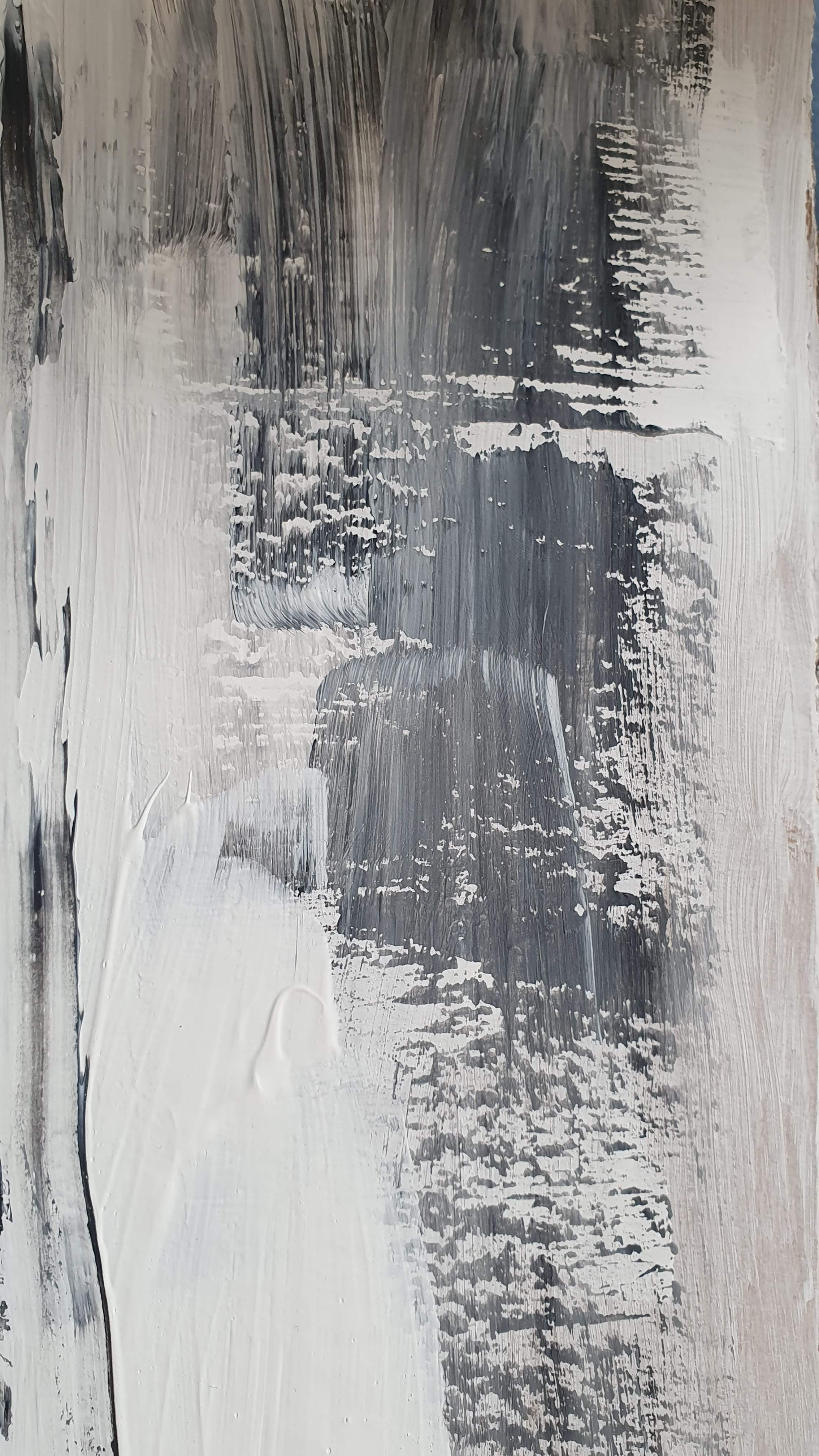
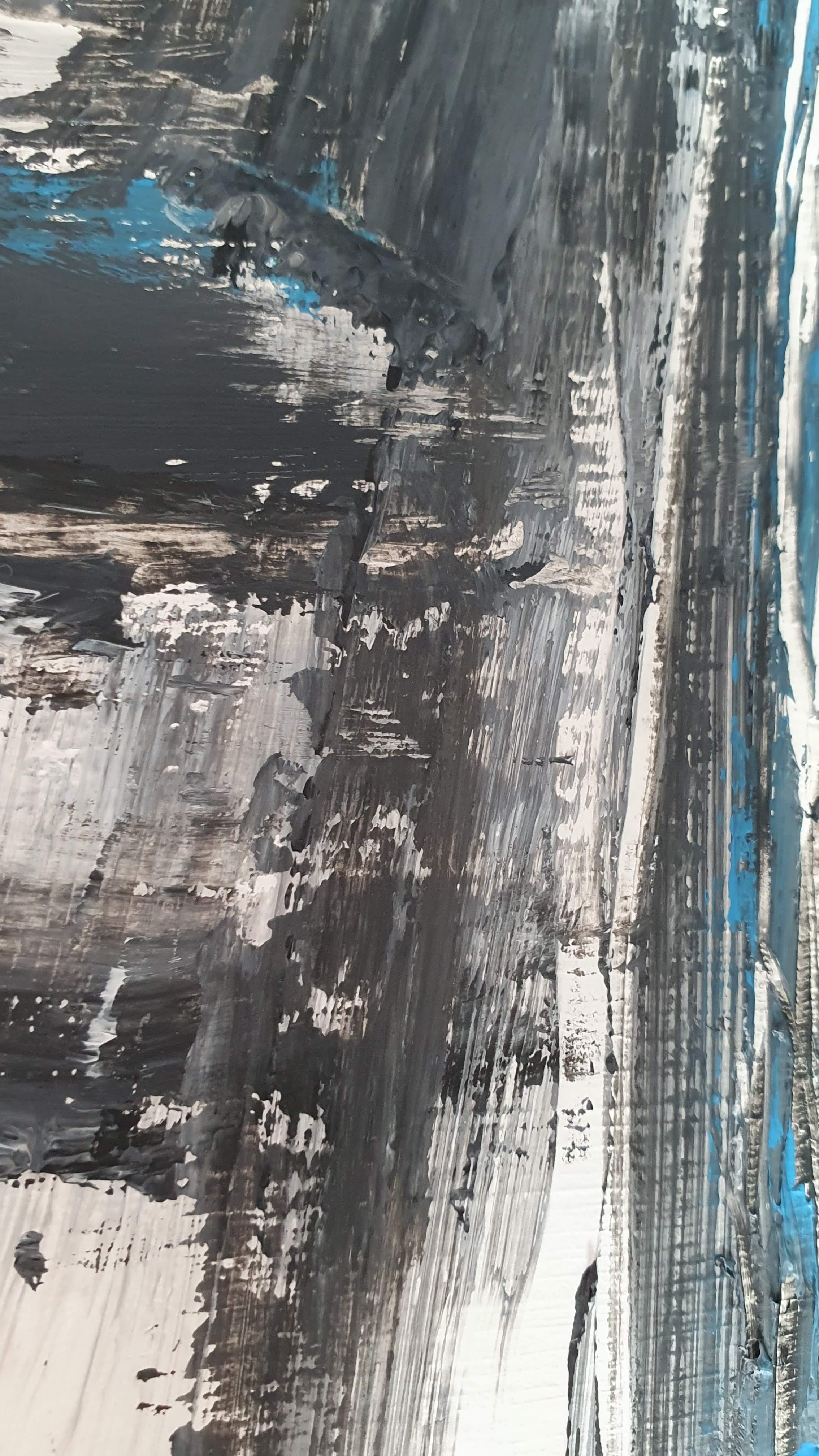
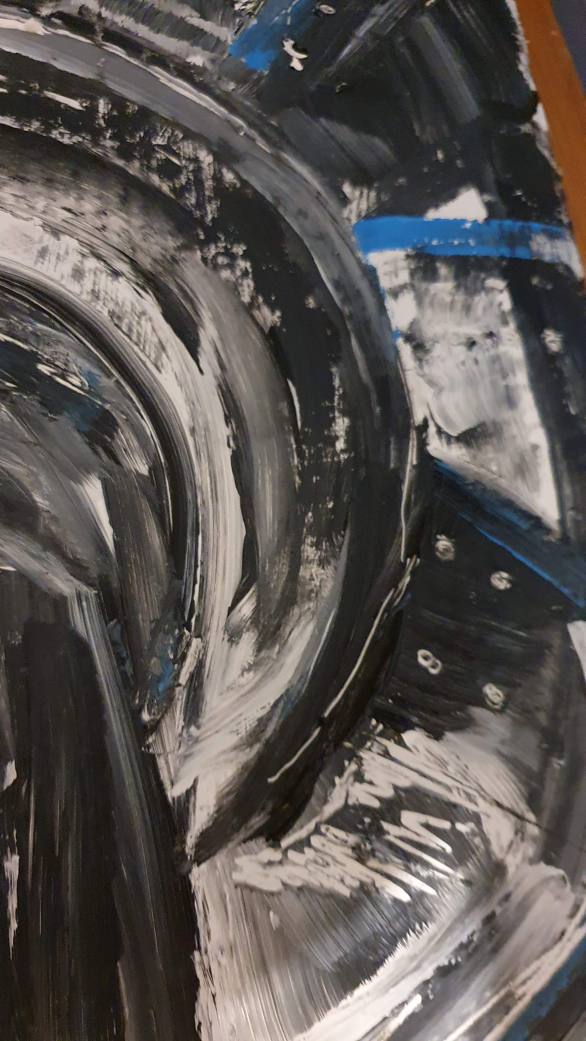
Reflection
What a lovely luxuriant feeling it was drawing wet on wet! Working in this way was very sensory with the paint pushing against each other , sometimes merging, often creating a barrier and always feeling appropriate to my subject in giving a sense of power.
Dragging card scraps across the paint created a juddered effect. In some places I chose to leave the paint thick and coarse and in others I used my fingers and the flat of the cardboard to smooth and blend.
I decided to scratch and mark make into the paint with tooth picks, to add textural variation and a sense of the bolts in the mechanism.
I worked at speed, referring to my sketchbook drawings. The scale and materials being different to my usual practice necessitated a dynamism in the focus to draw and guide the paint being mindful that as I was working at night under the heat of a lamp I was anxious to not let the paint dry. Whilst working I was listening to music with a steady pulse, as one might do while jogging.
I feel that the sketchbook preparation helped me focus while drawing here (during my Foundation in Drawing my tutor periodically reflected on my need to do this more). I feel that the boldest of this piece is true to my practice, particularly my monoprinting but I will repeat this exercise with another image to investigate a more delicate approach on a smaller scale and I will vary the thickness of paint to create a juxtaposition between the structural focus and the delicacy of the drawn image.
Exercise 1.3 Experimenting with dynamic gesture – 2
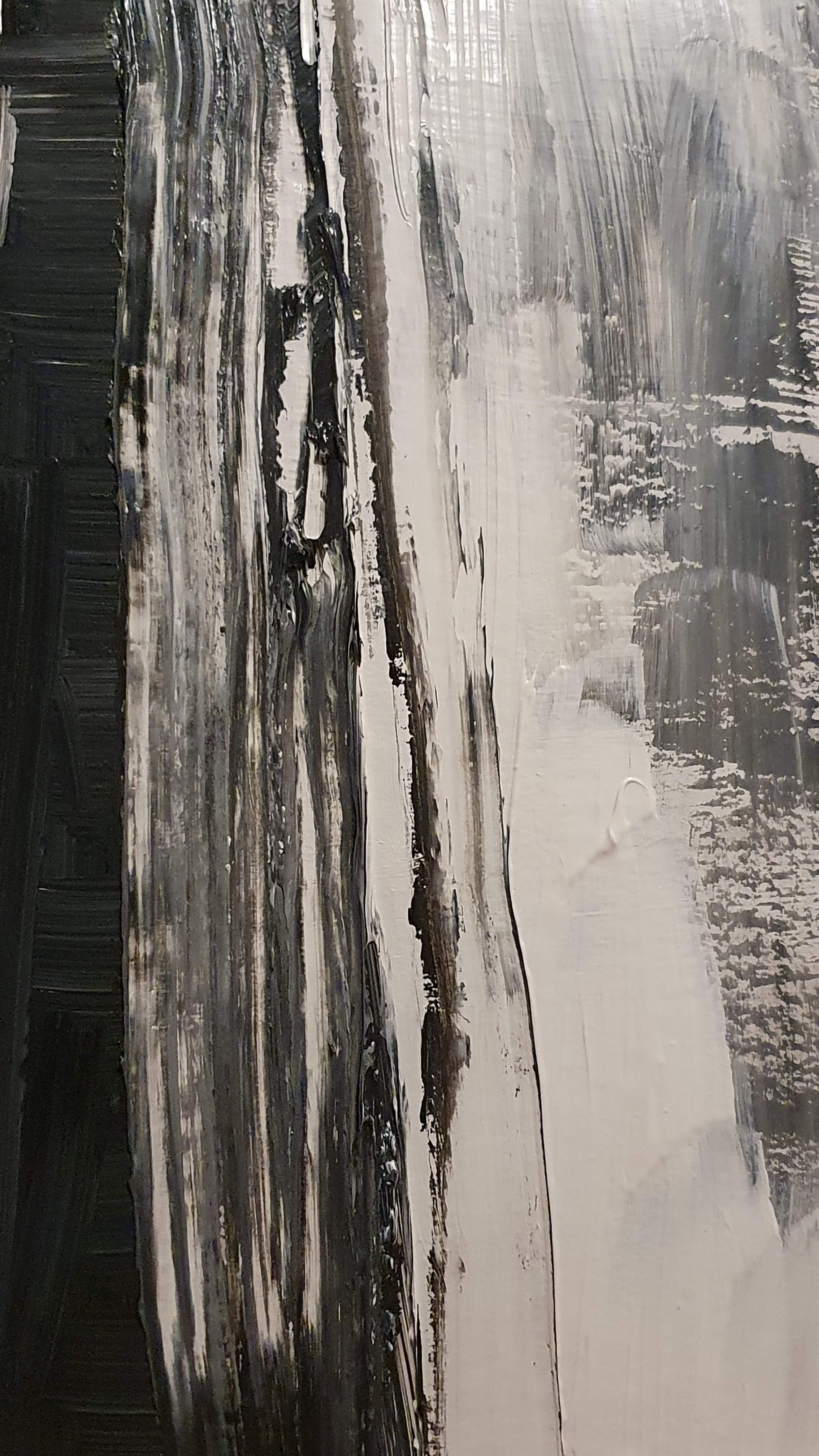
To repeat this exercise and work on a contrasting outcome I have chosen this image of the Tyne Bridge.

In my sketchbook I made charcoal drawings and explored making a subtractive drawing the structure with chalk additions. I felt that subverting the colours was something that I enjoyed and that I would work on a much smaller scale. The original photograph was taken while crossing the Tyne Bridge on the way to visit the birthplace of my paternal grandfather. The journey, like the photograph, was a blur with intense feeling.


Again I primed a piece of cardboard with gesso, this time 12cm x 17.5cm. I worked with black and white slightly diluted acrylic with black being the base colour.

Drawing with white on black created a metallic grey with varied tone which I was really pleased with. Again, I worked quickly but with a more gentle application of the paint as I was working to not lose the white in the tar like black. I sought to create a juxtaposition of delicacy and strength in the image and I think this has been achieved; the areas where the black has engulfed the white causing the supportive struts of the bridge to look fragile and fractured are a suitable allegory for my exploration into the life of my father and his predecessors. The dramatic gesture was most evident when moving the paint with a toothbrush, the end of the paintbrush handle and cocktail sticks to create the effect of the meshed areas of the structure.


I am pleased with the effect and feel that it adds movement and texture to the piece in a way that compliments the subject
It was certainly a very different experience working at such a smaller scale but the action of drawing with fluid media onto a surface of fluid media was equally as impactful on building my experience and interest in exploring media in this way.
Contextual study point 4 : William Blake (1757-1827) and Henry Moore (1898 -1986)
William Blake
William Blake was a visionary, a poet, a painter and a printmaker. Described by Colin Harrison, curator of the Ashmolean Museum (William Blake: Poet, Artist & Visionary – a genius of early Romanticism in England, Oxford University 2015) as “never been surpassed in imagination, in extravagance, in the vividness of this imagery and from these early beginnings he came a towering figure, almost unknown in his lifetime.”
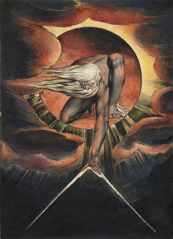
fig. 1 William Blake ‘Europe’ Plate i: Frontispiece, ‘The Ancient of Days’ 1827 (?) © The Whitworth, The University of Manchester
For this contextual study point I have sought to extend my understanding of his method more so than his subject matter or distorted visions.
Blake devised a way of etching into copper plate both his poems and drawings as shown here by Michael Phillips :
Phillips reprints from Blake’s plates and he is able to give an insight into Blake’s techniques.
Florence Bell, Director of Floga, an independently run organisation which promotes Art History and Yoga in schools and communities , in her review (https://artuk.org/discover/stories/artist-in-focus-william-blake) of Blakes spiritual vision and innovative technique describes how he added drama to his work. She notes :
“Satan Calling Upon His Legions (Victoria and Albert Museum), is a gloomy and moody image. Composed of blacks, blues, and greens – the landscape surrounding the figures seems two-dimensional and non-descript. Out of the darkness you can just make out the shape of a mountain, and slight depth. On further examination, figures can be seen strewn across a rock, while Satan stands with arms spread at the pinnacle. Here, Blake was attempting a new technique of applying paint without any ‘oily vehicle’, hence its final, darker, outcome. This was not an uncommon side effect. Other works such as The Bard, from Gray (Tate), has also suffered discolouration due to Blake’s experimentation with various materials and methods – in this case, he used an initial preliminary layer of chalk and glue.”
Anne Maheux noted : “With most of his watercolors, Blake started with a preliminary drawing in graphite or pen and ink. This provided the foundation for the finished watercolor. In all of the watercolors examined, the preliminary drawing is still visible to varying degrees” (Blake : An Illustrated Quarterly 2019″.
I am drawn to these experiments with media and also his striking images. I enjoy his use of colour and tone. Blake’s world view was one of complexity and reference to his spirituality, he dabbled with a range of religious sects in the 1790s, only to leave soon after joining. He had visions both in sleep and wakefulness and these informed his poems and artwork alike. Colin Harrison comments that “It is often said that you have to know the rules to break them and this was certainly true of Blake,” reinforcing the view that Blake was one of a kind.
Henry Moore

Fig 2 Henry Moore Study for Shelter Sleepers 1941
I find Henry Moore’s wax resist studies gloriously textured and his markmaking so natural and structural. The combination of dry and fluid media adds a sense of familiarity to his drawings.
 fig 3 Head 1974, CGM 228
Moore said : “Drawing, even for people who cannot draw, even for people not trying to produce a good drawing, makes you look more intensely.”
Many of his drawings were studies for subsequent sculptural work, however he also valued drawing as an outcome in itself.
“Moore was an exceptionally talented draughtsman, producing a body of nearly 7,500 drawings over seven decades; this exhibition will explore the many different ways in which he used drawing. He found that its eclecticism and ease of use made drawing an ideal medium for a wide range of purposes: from a tool to study natural forms or the work of other artists to means for the development of new sculpture, or as a way to experiment with languages and techniques. However, for Moore drawing was not merely a means to an end, but also a medium for finished artwork in its own right – so much so that he was sometimes referred to as a ‘sculptor and painter’.” (Henry Moore : Sheep. 2016).
His methods reveal an enquiring approach… “the often experimental nature of Moore’s approach, including the adoption of what he called ‘sectional lines’ (a technique he developed to suggest three-dimensionality on a flat sheet of paper), and the use of photo-collage, photocopies and new mediums such as felt-tip and marker pens” which inspire investigation.
References
fig. 1 William Blake ‘Europe’ Plate i: Frontispiece, ‘The Ancient of Days’ 1827 (?) © The Whitworth, The University of Manchester at : https://www.tate.org.uk/whats-on/tate-britain/exhibition/william-blake-artist (accessed 15th March 2020)
fig 2 Henry Moore Study for Shelter Sleepers 1941. Henry Moore :Henry Moore Drawings: The Art of Seeing at https://www.henry-moore.org/whats-on/2019/04/03/henry-moore-drawings-the-art-of-seeing (accessed 20/03/2020)
fig 3 Henry Moore Head 1974. Henry Moore: SHEEP 15 Oct 2016 – 15 Jan 2017
Touring exhibition in Memmingen, Germany at https://www.henry-moore.org/whats-on/2016/10/15/henry-moore-sheep (accessed 20/03/2020)
Colin Harrison, curator of the Ashmolean Museum (William Blake: Poet, Artist & Visionary – a genius of early Romanticism in England, Oxford University 2015) at : https://www.youtube.com/watch?v=4IH-6R0XaGc 19 Feb 2015 (accessed 15th March 2020)
WILLIAM BLAKE : 11 SEPTEMBER 2019 – 2 FEBRUARY 2020 at : https://www.tate.org.uk/whats-on/tate-britain/exhibition/william-blake-artist (accessed 15th March 2020)
Florence Bell, Artist in Focus : William Blake at : https://artuk.org/discover/stories/artist-in-focus-william-blake (15 November 2016) (accessed 15th March 2020)
Michael Phillips : William Blake Prints : Making the Plates at : http://www.williamblakeprints.co.uk/how-the-prints-are-made (2018) (accessed 15th March 2020)
Henry Moore OM, CH 1898–1986 at : https://www.tate.org.uk/art/artists/henry-moore-om-ch-1659 (accessed 20th March 2020)
Exercise 1.4 : Invention and Mystery
For this exercise I opted to investigate how I could combine two objects to make one sculptural form. I found selecting two objects that I was happy to be combine difficult to decide on and this resulted in some variation of my ‘two objects’.


I began by making quick drawings to explore different interrelationships.


I then added fluid media to develop the best of these drawings. I used a selection of coloured Winsor & Newton inks with a fine sable brush.


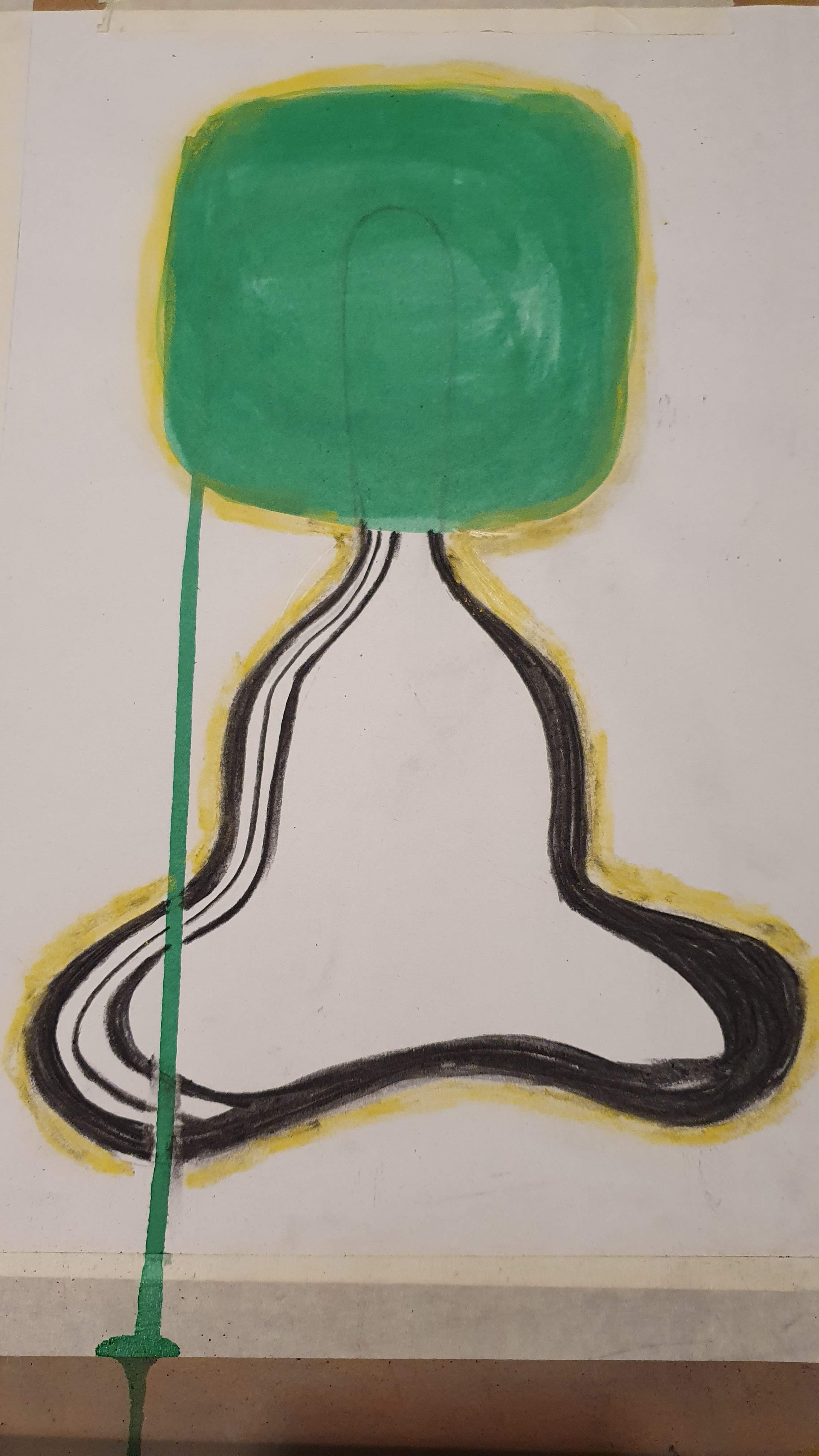
Leading from the drawing above of the paint brush and the cobbler’s last above, I made an A2 drawing using green drawing ink, pencil, charcoal and yellow soft pastel.
Reflection
The shape of the two objects combined looked to me to be reminiscent of someone sitting crossed legged in meditation. While drawing this I am at home in a time of widespread self isolation and social distancing as a result of the corona virus. My own experience and that of my friends and pupils alike is that we are connecting with nature as a way of regulating our emotions. I wanted to express this in my drawing by drawing a shape in green, that clouds the ‘headspace’ of the brush handle. Additionally the line of green was a happy accident and I feel that this adds to the drawing and lends itself to the title ‘wired’. I decided to use the fluid media in this way to change the drawn form. It is often a challenge for me to leave a piece of work or decide I have finished but I feel that I have managed to gauge completion this time.
Although I was aware of occlusion in my preliminary drawings, for this outcome I felt that the suggestion of a new symbolic object was intuitively how I should tackle this exercise.
I feel that the drawing i) is true to my observation of the objects and the way that they fit together ii) is a bold image that fits the brief of ‘Invention and mystery’ iii) is led by my own response. Although I used the fluid media in a non-conformist way it absolutely enabled the outcome that I was aiming for.
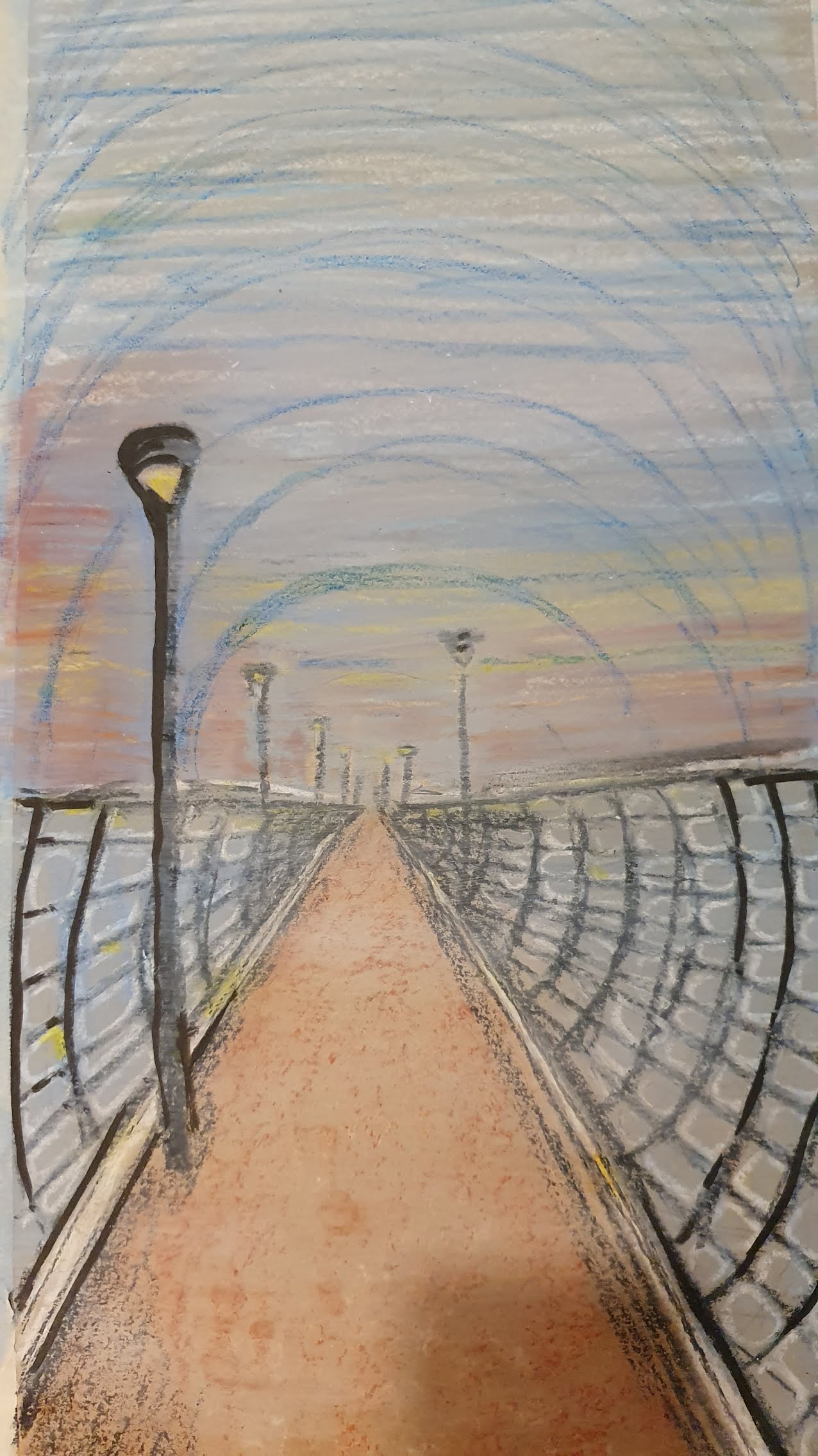
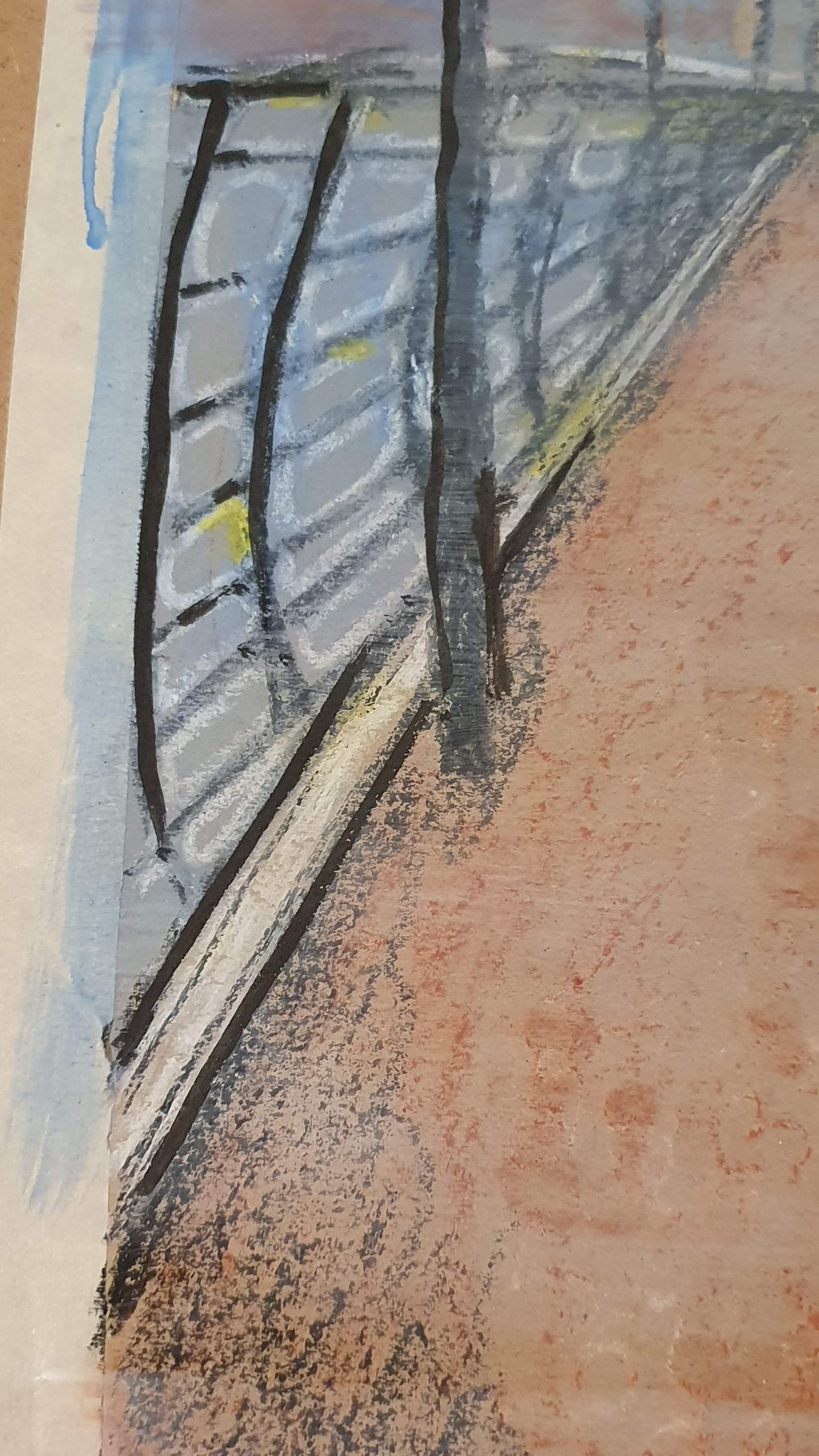
Assignment 1 : Assessment Piece
Inspired by the tonal colour palette of Blake and the wax resist of Moore, my assessment piece is a wax resist drawing of Dover pier, empty at twilight. I drew the image on the pier with 6b pencil and then returned home to develop further. I chose the pier because it is a beautiful structure, normally teeming with life but in the current context it is empty and silent but for the sound of gulls and the movement of the waves. I waned to give a sense of desertion and forward movement and I think both the wash and the use of line does this. On the original picture the curved lines in the sky give a sense of resonance. I do not think it is the technically best drawing I have done but it reflects my study and exploration of fluid and dry media during this part of the course.
The drawing is 32cm x 60 cm and drawn onto brown parcel paper. I used tube watercolour, wax crayon and water-based drawing ink. I ‘faded’ the image using a white wash and then picked out some lines with the black ink.

Assignment 1 : Self assessment
Demonstration of technical and visual skills | Use of wet and dry media; choices made regarding use of colour, scale and technique; use of fluid media for tonal effect worked well; noted awareness of negative space in drawing. Range of scales used. |
Quality of outcome | Outcomes are bold and although this lends itself to this part of the course, focus on more precise and ‘delicate’ work would be useful. How useful is the blog layout to my tutor? Positive feedback from friends and fellow OCA students so far but if necessary change. .Have aimed to reflect research in outcomes for exercises. |
Demonstration of creativity | Experimentation evident in my approaches to exercises especially the wet on wet drawing of the lighthouse mechanism. Remember to add video/photographs that show processes. |
Context | Research could be more in depth – have tended to focus on processes of artists and the way that they work – was this the intention? Is referencing adequate? I tend to be reflective and evaluative but I need to make time to act on these to move my practice on. |
