Exercise 2.1 : Using Collage to extend mark-making
Preparation : I spent some time making a collection of mark-making samples using pencil, ink, charcoal, chalk, wax crayon, pen and watercolour. I used cross hatching, loose movements, wax resist patterns, rubbings of woodgrain and line including geometric patterns.
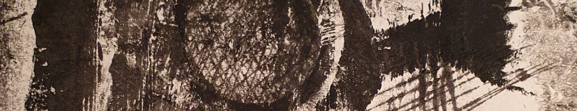
Subject : During this current time of social distancing and self isolation, I am aiming to make observational sketches on my daily exercise walks. The subject for this collage is the Drop redoubt, a Napoleonic fort in Dover near to my home that I enjoy walking to and around the dry moat. It is a very inspirational location that is hidden to the outside world and can only be reached through a small tunnel in a hill. On particular this walk, I made a simple quick sketch with a 0.8 micron pen in my A5 sketchbook.

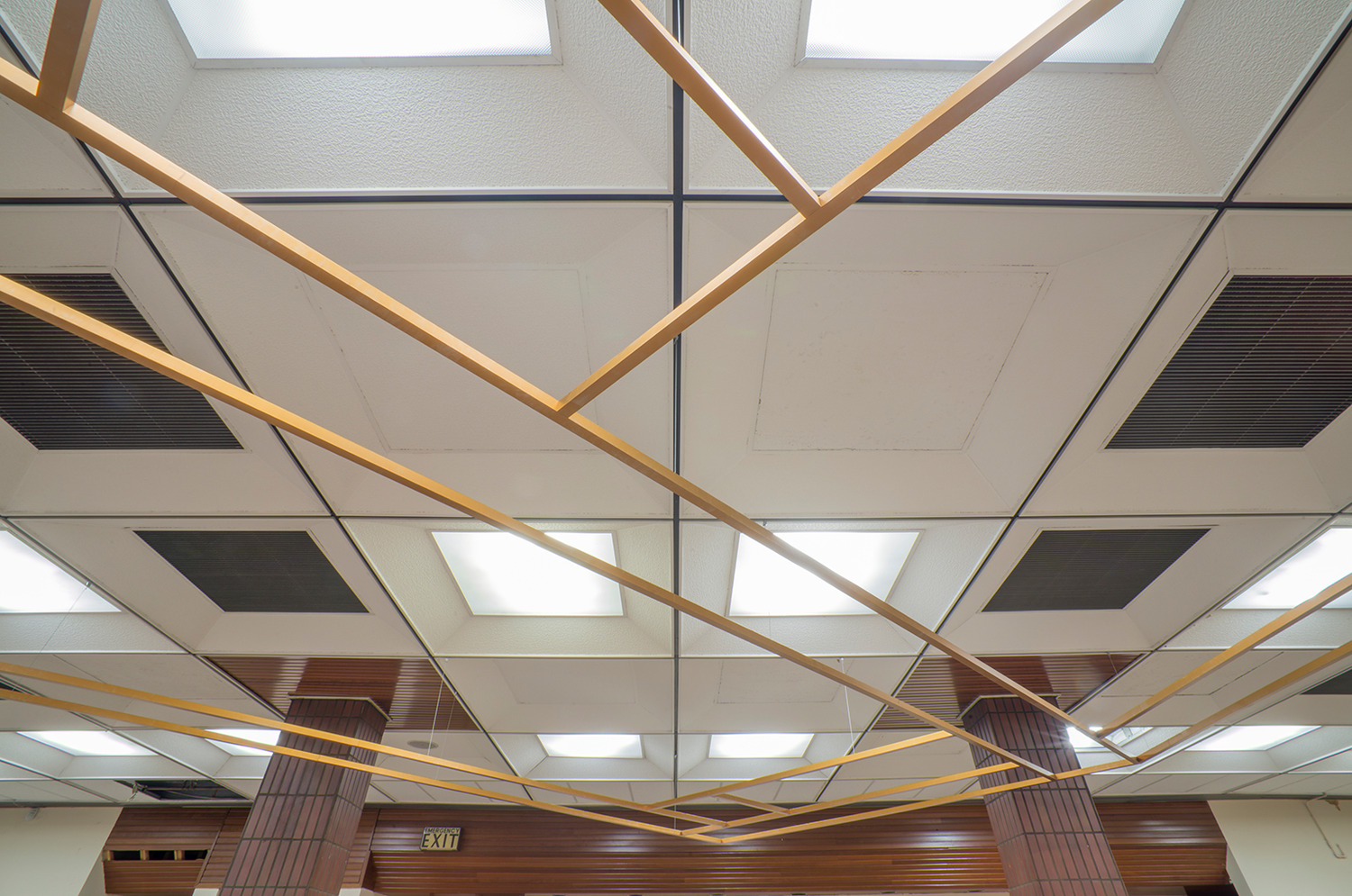
Process : On A2 textured lining paper, I made a brief outline guide sketch of the recorded view. Onto these guidelines, I glued cut and torn pieces of my mark making sample, using a view finder to hone in on interesting pieces.


Reflection :

I am pleased with this outcome and feel that I have managed to gain a sense of perspective as well as a sense of how vast the site is. After two days I have looked back on this and considered that I do not wish to add any additional drawing or manipulation of the image. I had though initially that I might opt to add a colour wash to indicate both the sky and the grass, however on reflection I do not feel this is necessary to enhance the outcome and would have been more about fulfilling a need for ‘completion’.
I enjoyed the progress of this piece and in particular the variation of mark-marking and how it worked together, with the rubbing being really versatile throughout. For some areas I felt tearing with appropriate and others cutting was more so. I noticed the impact of layering in building textural effect as well as the opportunity to bend, fold and reshape cut pieces. This is not something I have ever done before so I shared with friends and fellow students on the course and the positive feedback was great.
Comparison :
I have chosen to compare this piece with a drawing that I made last summer of some buildings in Dover town :


In the drawing of the street (A1. 2019), I have used bold lines which is my style and some looped mark making on the tiling of the small roof. While I am pleased with both drawings I am particularly drawn the the collage, it feels to me that there is more texture and variation and is more of a completed piece. I am surprised by this exercise as it has lead me to rethink ‘collage’, especially as a primary schoolteacher, this is not an application of the method that I have ever used or considered, and I am now excited to continue to investigate this further and discover the possibilities in my outcomes.
Exercise 2.2 : Using collage to be specific about tone
Preparation : I collected together a combination of found and prepared tonal collage materials for this exercise. I used air dry clay to make a selection of free-form structures to use as my subject matter. While making these I was inspired by wave patterns both in sound and of the sea, thinking also of shell forms. I left the structured unfinished in terms of glaze as I wanted to maintain a chalky appearance. I experimented with different variations of arrangement against a white paper background and positioned a lamp to maximise tonal variation.


Subject : I made some preparatory tonal drawings in my sketchbook to guide my decision making on the subject and arrangement. The drawings enabled me to develop a clearer focus on tonal variation.


Process : I worked from the observational drawing, focusing on tonal blocking. I wanted to do this because I felt that if I referred back to the clay structures my focus could be on these as objects rather than on the tones that I wanted to express in my collage. i built up the image by laying the collage materials on the paper and loosely drawing the tonal shapes by lifting and checking the paper in a method similarly to how I work when monoprinting. I periodically left the work shape to look from a distance with squinted eyes to compare tonal accuracy with the drawing I had made. I chose to add some pen and pencil lines when I had completed the piece.
Reflection :


This piece is approximately 42cm x 18cm.
I am really pleased this outcome. I feel it is quite a ‘crisp’image. When placing the drawing and collage side by side the tonal representation is comparable. As with the drawing I have developed a sense of depth in this work.I perceive that I have achieved an extensive tonal range as was suggested in the prompt for the exercise.
Although in the previous exercise I have also created a sense of depth, I feel that this piece is truer to the subject and I certainly felt and am feeling that there are so many possibilities for using collage in this way.
I am, as suggested, exploring transcribing tonal shapes in my sketchbook. This work can be seen in the Blog feed – Research : Sketchbooks section of this Learning Log.
Contextual Study point 5 : Brooklyn Collage Collective
*Please note the two of the websites suggested to research are no longer relevant
The Brooklyn Collage Collective is an online collaborative gallery.
“The mission of the collective is to bring attention and credibility to an otherwise under-recognized medium, elevating the art forms limitless ability to create a dialogue through assemblage and to build a strong community of collage artists”.
I was already aware of their work and ethos as i have followed them for sometime on Instagram https://www.instagram.com/brooklyncollagecollective (which I was led to through my interest in the Pop Artist Richard Hamilton) and so I was suitably thrilled when they featured in the course materials.

“City of Boom” by Morgan Jesse Lappin (2016)
The Brooklyn Collage Collective is a current, vibrant and expansive movement. One of the participants, Maddie Goldberg considers collage to be a “meditative process as well as a creative process,” and a method to which she felt she “was hooked instantaneously.”

(Instagram : https://www.instagram.com/maddiegoldberg )
In the current situation of social distancing there has been a substantial growth in the use of the internet as a means for creative collaboration. The hashtag #covid19artistsathome signifies a global collective that is building.
I feel there is strength in collaboration, not least through the sharing of workspaces, materials and the opportunities to exhibit and inspire through collaborative work with schools and community groups. Locally I participate with the Art 31 group, Kent Art Teachers, Artswork and Dover Arts Development. In fact through my involvement in these groups I have trained as an Arts Mark assessor and was inspired to follow my interests to study first for a Foundation in Drawing through the OCA and now on the BA Fine Art study pathway.
I reflected on which are the activities that are currently supporting my wellbeing and made this collage as a comment on this : film, art,craft, nature and music.

‘Whatever will bee.’
References
http://www.brooklyncollagecollective.com/about
the weird and wonderful collages of morgan jesse lappin
https://www.instagram.com/brooklyncollagecollective
https://www.instagram.com/maddiegoldberg
https://blendednyc.com/art/2018/4/28/brooklyn-collage-collective
http://www.kolajmagazine.com/worldcollageday/2020/index.html
Exercise 2.3 : Putting one thing next to another
Preparation :
I collected six full page magazine images (using Flow magazine which I knew would have interesting images). I scanned and reduced the images to plan layout and ideas in my sketchbook. This also enabled me to make a decision about which four of the images I would use for the exercise.


When thinking about how the four pieces would work together or independently, I was drawn to the theme of Covid-19 in relation to my often used themes of space and identity.
I considered both dry and fluid drawing media to complement the commentary of each piece as well as starting collaged image. It seemed appropriate to me at this point to consider a title for each piece. Each title worked as an intention that I wanted to convey.
Process :
- Applause (A2) Collage and ink on paper

I used black drawing ink with a dip pen and brush on wet and dry paper. Once I started working on this I changed direction from the clapping hands I had planned. I felt the rainbow image is so immediately associated with the weekly applause. The large NHS banner hanging on the railings of an affluent home is a telling juxtaposition of the situation we find ourselves in, where all strata of society are reframing the role of the key worker.
2. Together and apart (A2) Collage, watercolour, soft pastel and pencil on paper.

I picked out the colours from the photographic image and built a wash of colours across wet paper. When the paper dried I added soft pastel to soften the image and drew the lone figure with 8B pencil. I am really pleased with the chaotic effect of the watercolour colours merging and find it to be an apt representation of emotional state during this time.


3. Personal Space (A2) Collage, charcoal, putty rubber, soft pastel on paper

I used subtractive drawing initially for this piece. I then used soft pastel to add to the form of the ‘virus’ and to enhance the sense of depth. I enjoyed working on this and am really pleased with the outcome.
4. Listen to me.The song of the youth. (A2) Collage, watercolour and pen on paper.

I was aiming for simplicity in this piece. The climatic crisis is still very present despite our focus being elsewhere. I felt that a simple blue wash and line drawing were sufficient.
Reflection :

It took me some time to feel motivated for this task. My initial reaction was that it felt like less interaction with the collage material than my previous collage work where I was able to manipulate the image. However once I had chosen the focus for this work, and how these pieces would interlink as one commentary outcome, my perception shifted.
I am content with how this exercise has panned out. I think they work as individual pieces as well as together.
When considering the juxtapositions I think they are complementary in that they continue a narrative. The character of my drawing was led by the collaged material and I aimed for this to be reflected in my choice of materials, use of colour and the titles that I gave to each piece.
Contextual Study point 6 : Toby Paterson and Cy Twombly
Toby Paterson (1974 – ) is a contemporary artist from Glasgow who is, writes Jennifer Lack (The Guardian 2009), “Mainly concerned with cities and modernist architecture, Paterson is influenced by both his physical experience of a place (often on skateboarding journeys) and his interest in its history, asking ‘what cultural, political and economic situation had made that place exist?’ “
Lack comments that “His large-scale wall paintings featured abstract shapes in subdued colours, like disseminated components of a building suspended in a solid grey wasteland of paint. They looked like one of Mondrian’s paintings blown to smithereens. Some felt he was subverting the modernist aesthetic, allowing these rigid structures to float free, but it was difficult to judge whether Paterson was celebrating or castigating modernism…”
Paterson shows a commitment to public art, creating new spaces and adding to our structural environment. When reflecting on his installation at Dunfermline Library as part of a series in 2017 he said :
“Although I studied painting at Glasgow School of Art, I frequently make work outside conventional gallery settings as a way of reflecting the inspiration I find in the built environments that surround us.
Whether it is large installations or smaller pieces of work, it appears to me that Paterson uses his environment as collaged material, beyond simply inspiration. The structures that he observed are drawn into his work.


When looking at Twombly’s collaged work,I note that the effects of layered textures and juxtaposed forms. The Natural History pieces are reminiscent of scientific or sketchbook study. They show a detailed urgency and the sense of being ‘working documents’.
This collaged work is not at odds with Twombly’s painted and drawn work. It maintains the urgency that is so recognisibly his way of working. As Twombly said himself
‘When I work, I work very fast, but preparing to work can take any length of time’.
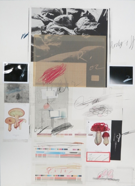
Twombly, Cy. Natural History, Part 1: Mushrooms No.X (1974)

References :
Lack, Jennifer . The Guardian.Artist of the Week 31: Toby Paterson ( 4/03/2009) at : https://www.theguardian.com/artanddesign/2009/mar/04/toby-paterson-modern-institute
McRoberts, Ally. Dumfirmline Press. Artist Toby Paterson’s final work for town is in Dunfirmline Carnegie Library & Galleries (11/05/2017) at : https://www.dunfermlinepress.com/news/15279859.artist-toby-patersons-final-work-for-town-is-in-dunfermline-carnegie-library-galleries/
https://www.nationalgalleries.org/art-and-artists/88186/hamburg-relief
https://www.themoderninstitute.com/artists/toby-paterson/
Serota, Nick. The Guardian. ‘I work in waves. In a rare interview the renowned US artist Cy Twombly talks to Tate director Nicholas Serota about his astonishing work’ at : https://www.theguardian.com/artanddesign/2008/jun/03/art1
Cy Twombly Cycles and Seasons at : https://www.tate.org.uk/whats-on/tate-modern/exhibition/cy-twombly
https://www.worthpoint.com/worthopedia/cy-twombly-signed-abstract-1999-lot-1837266214
Exercise 2.4 Adding a collaged element
Preparation
As suggested in the course materials, I reviewed my work from Part 2 so far as well as the work from Part 1 which I felt I would like to develop further.
In Part 2, I like the strong narrative of the Covid-19 themed work in exercise 2.3. I felt that I would like to extend this as well as further development of the combination of fluid and dry drawing media from Part 1.
I made the decision that this work for this exercise would reflect my experiences of emotional well being during the lockdown; both personally and in response to the children and families that I support in my work role.
I set myself the challenge of developing self portraiture through this context and this has been the focus of my sketchbook work. I have always found that I have a tendency to try and over detail self portraits so my intended outcome was to be more gestural.
In preparation I took photographs of different facial expressions to support my drawings using a mirror.


Process
I have worked using a range of scales using the collaged elements in different ways.
- Heaven is a place where nothing ever happens (A3. Ink, wax crayon and collage on paper) The collage image here is a photograph of a building in Folkestone which is opposite the Quarterhouse, one of my favourite local venues and a place that I miss during this period of confinement. ‘Heaven is a place where nothing ever happens’ is a lyric from ‘Heaven’ by Talking Heads. This illuminated sculpture by Nathan Coley is now a familiar part of the skyline in Folkestone. I was reasonably pleased with this as I worked quickly and without too much pained focus on likeness.

2. The Grand Shaft (A2. Watercolour, charcoal, soft pastels, collage on textured lining paper ). The Grand Shaft is one of the many historic architectural wonders of Dover. It is a structure that houses concentric staircases to take different ranks of the military at speed from the cliff to the seafront. The Grand Shaft makes me think of escape and concealment and felt that this would be an appropriately collaged eye. I like how this begun but feel that I overworked the face in a way that was not necessary.


3. Sound and Vision (19cm x 11cm. Oil stick, wax crayon, acrylic, collage on found coloured card). I have used the sheet music for Sound and Vision by David Bowie as the collaged piece for this drawing. I live in a very musical house and this song specifically is my route to others as the ring tone of my phone for both happy catch ups and remote ‘well being’ discussions that I have been maintaining for children and their families. I like that lack of focus that the face seems to have and my thoughts were referencing the work of Geraldine Swayne as I worked.

4. The Moment (A5, Watercolour, pencil, Brush pen, collage on textured paper)
The collaged text here is from an ‘out of order’ notice on a self service ticket machine;the rest of which is used for ‘Crisis Point’. I’m pleased with the outcome of this work and I feel that it functions as part of a triptych with the next two pieces below.

5. Crisis point (A5, Watercolour, pencil, Brush pen, collage on textured paper)

6. Flight (A5, Watercolour, pencil, Brush pen, collage on textured paper)
The collaged piece here is a photograph of me as a child. I’ve used the red paint to link the image to the self portraits in the previous pieces in order to see them as a whole piece. In this piece I am aiming to express the impact of nature (and the increased prevalence of birds since the lockdown) on well being.

Reflection
I am pleased with the outcome of this work. Although I feel that the application of the collage is limited and without much variation, this is something that I will focus on for my Assignment Two artwork. I feel that there is a plausible narrative between the three pieces and that I have built on previous work of using fluid and dry media. The positioning of the red watercolour is reflective of emotional state and the subject looking out of the third picture while the others are not gives a sense of a secure mindset and a positive connection with the environment.


Contextual study point 7 : Anna Bu Kliewer and Flynn Cameron Jones
Anna Bu Kliewer


I like Anna Bu Kliewer’s work. I think her seamless collage and use of moving image is very effective. I enjoy her juxtaposition of people, nature and architecture. This is definitely thought provoking surrealistic work. I find the work more reminiscent of the work of the Brooklyn Collage Collective rather than Paterson or Twombly. This are crisp images that feel reflective of a current visual and media zeitgeist.
“Driven by her curiosity about other realities, time and space, she likes to challenge one’s perception of identity and environment by transforming found imagery into a new, surreal context.” (https://annabukliewer.com/about)
I find Bu Kliwer’s work to give a rather obvious nod to the work of Richard Hamilton and also John Stezaker :

Hamilton, Richard ‘Marcel Duchamp’ (1967. 800 × 585 mm )

Stezaker, John ‘Mask XlV’ (2006. 240 × 200 mm)
Flynn Cameron Jones work absolutely made me think of Toby Paterson’s architectural geometric layering. I really like the way he uses both animated and static images. His layering both reflects and jars. Although he works with both digital and physical techniques his preference is paper based :
“You can miss out on a lot of information when sourcing material online that might change the way you view the image. The process of collage for me is somewhat ritualistic and it would simply not satisfy me if I could not cut into, arrange, and stick the actual object”. (Interview for Majestic Disorder. Sean Stillmaker. 2020)


As well as Paterson, his work reminds me of Erik Winkowski, a contemporary american artist who uses video as collage ( https://www.erikwinkowski.com/ )

I enjoy the work of both but feel Bu Kliewer’s work, while the images are powerful, feels to me to be more staged and suited to a fashion magazine in style. The drama of Jones’ work really draws me in.
References
https://thearchivecollective.com/2015/10/anna-kliewer/
https://annabukliewer.com/about
https://www.tate.org.uk/art/artworks/hamilton-marcel-duchamp-p79814
https://www.tate.org.uk/art/artworks/stezaker-mask-xiv-t12347
https://flynncameronjones.tumblr.com/tagged/Collage
https://www.erikwinkowski.com/
Assignment 2 : Preparatory work and investigation
For my assessment piece I aimed to widen my collage techniques while expanding and developing on the themes that I have developed during Part 2. I have continued to have fluid and dry media as technique linking this work and endeavoured to maintain a narrative.
Firstly, I experimented with an acrylic medium lift, combining this method of collage with watercolour and brush pen drawing. I worked on gessoed watercolour paper, applying layers of paint, drawing and the image lift from a glossed magazine page.
 I like the outcome of this piece and am pleased with the quality of the transferred image. I think that the colour from the paint and the image enhance each other, with an almost ethereal quality to the transfer that adds appropriate context to the drawing. This piece is 21 x 29.5cm.
I investigated combining collage materials with watercolour and wax resist. For this next piece, working on textured paper , the collaged material used for the sea and the seagulls is a still from a video I made as part of a community of local artists project. It shows the bubbling waters of a waterfall at nearby Kearsney Abbey. I painted the ‘sea’ with watercolour. The sky was created with wax resist, watercolour and pencil crayon. The pier is cut from a photograph of Deal pier. The gulls are glued at the wings to create a shadow.

I really like the effect of the watercolour on the collaged material for the sea. I think this works well as an image and that my work is reflecting the research stemming from the contextual study points. This piece measures 25x 26cm.
Lastly I experimented with encaustic drawing and collage. I noted the suggestion in the course materials and investigated further (this technique was a total revelation to me) and invested in some equipment. I produced a number of images, subsequently deciding on one as my assessment piece. It was with some trepidation that I started this work but I am very pleased with the outcomes.


15 x 11cm

10.5 x 7.5cm
I think that there is a tangible depth to these two pieces and although this is a technique that is new to me, I am pleased with the effect and this is why I have decided to chose the following final piece as my assessment piece.
Assessment piece : 15 x 11cm

I have chosen this piece as I feel it expresses movement and depth.
Throughout this collage focus, it has been my intention to use the collage as an embedded element of the drawing,adding texture to a fluid surface. In this piece I feel that the collaged image of the seagull fits within the drawn shapes, picking up on created angles. The key for me here in terms of the completion of this piece was that I had an overwhelming sense of the strong connection between the bird as a necessary part of the image. In consideration of my developing practice, despite feeling some anxiety over the collage work, I have a sense of progress in technique while maintaining a sense of identity through the narrative. .
Assignment 2 : Self Assessment
| Demonstration of technical and
visual skills |
Development of new techniques. Exploration of encaustic drawing in particular to create depth. Some range in scale. Exploration of colour and texture. Reference to fluid and dry media in part 1. Making critical decisions about areas to develop eg portraiture and quality of line. |
| Quality of outcome | Continued boldness of outcomes. Developed more of a sense of ‘completion, able to make decisions about my work. Development of narrative- aiming to create flow. |
| Demonstration of creativity | Applying other art forms to contribute to work eg clay work and film. Striving to appoint a thematic narrative to work, reflecting the current situation with a personal focus on well-being. Have started adding titles to work. Experimentation with new techniques |
| Context | Linking artists. Reflection aims to be self-critical and pointing self in progressive thinking. Research is supporting thinking and enabling me to think critically about my developing practice. |
